Pantone: What is it and do I need to use it?
Pantone Colour is a colour-matching system universally used by many industries, including printing, graphic design, paint and the make-up industry, amongst others.
Invented in the early 60s, the Pantone Matching System (PMS) allows designers to colour-match specific colours regardless of the process used to produce it. This allows companies to assign an exact colour to their Brand, safe in the knowledge that it will match perfectly across every application for which it is used. Each colour in the Pantone Matching System has its own unique number (PMS number) and which allows for an exact match every time.
If you see PMS 1837 you will instantly recognise the Brand associated with it — Tiffany & Co. This colour, known as Tiffany Blue, is based on the colour of a robin’s egg.
Companies use Pantone Colours in their logos and advertising to synchronise their Brands and to ensure they are consistent across the board.
Do I need to use a specific Pantone Colour for my printed literature to look professional?
In short, no. A Pantone Colour can be matched using litho printing process. However, more printed literature is now produced using a digital printing process. Digital printing uses CMYK (Cyan, Magenta, Yellow and Key*), so although the latest digital printing processes can get near, they will not create an exact Pantone Colour match.
British Association for Print and Communications
Sidney Bob from the BAPC (British Association for Print and Communications) comments:
“In an ideal world printed documents should be produced in accordance with the Pantone requirements of the originator so that they follow any corporate discipline accurately and consistently. Unfortunately, in many cases this is not practicably possible.
However, while current digital and of course ink-jet technology cannot be absolutely accurate they do produce emulations that do not fall far short of Pantone colours. In any case it should of course be remembered that the same Pantone colours appear differently dependent on the material and substrate used.”
So what is Pantone used for?
If a company has a primary or standard colour, like the red used by Coca-Cola, or Microsoft’s blue, this can be replicated easier on a digital printing press, outdoor plastic signage and paint. However, some harder-to-match Pantone Colours only have to be one shade out to change the Pantone Colour from one PMS number to another totally different PMS number. Different printing processes will have different effects on the colour.
Another aspect to consider is the medium that you are printing onto. If you print the same colour onto two different stocks of paper, the colour will look different on each stock. It’s the same if you have a tin of gloss coloured paint — you can paint a wall and then paint directly onto brickwork and then onto glass, and on each surface the colour will be a slightly different shade.
Pantone has two sets of colours for the printing world: coated and uncoated. These two sets of PMS colours have the same ink but show the difference when printed on both a coated stock and an uncoated stock. Some colours do not look that different, while others change significantly. We have clients that use two Pantone Colours – one for coated stock and uncoated stock as the colours looked totally different even though they had the same PMS number… confusing!
*Key is also known as Black.
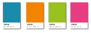
Pantone colours with CMYK breakdown
If I am not printing a specific Pantone Colour am I downgrading my Brand?
If you need business cards printed for a meeting in a few hours, you cannot have a Pantone Colour printed accurately on a digital printing press. Yes, you will get close, but you are not going to match it exactly. It just won’t happen.
Similarly, if you need a poster printed for an event, you can match the colour closely, as long as you are using a print company with the latest equipment. But once again, you are not going to match it exactly.
An exact Pantone match can only be achieved by mixing the ink and printing the colour separately to everything else – this is also called a spot colour. If you are not having your Pantone Colour printed separately as a spot colour then there will be a colour tolerance. In the example below, you can see the colour tolerance explained.
This colour tolerance will also be the same on a monitor. You can take all the care in the world matching up your printed literature to your website, but all monitors are different. If you have two brand new monitors next to each other, from different electronic suppliers, the colours on the web page will appear different. A red will still be a red and a blue still a blue, but they will have a colour tolerance. If you turn up the contrast or brightness then the colours will change again.
I think of it like this… If you walk into an electronics store and see 30 televisions on display all showing the same tennis match, you will notice that each screen will show a slightly different shade of green. The cameras picking up the feed are the same, the digital TV signal is the same, but every screen will still have a different shade of green. Whether it is Sony, Samsung, Toshiba, LG etc.

A colour tolerance chart shows the difference colours can change
Quick Print Pro Magazine
Martin Christie of Quick Print Pro Magazine comments
“In simple terms it is virtually impossible to match exact Pantone colour with digital printers that print with composite colours, ie creating one colour by mixing several others, as the mix will vary from one machine to another depending on how it reads the information fed to it.
Pantones, being solid colours, are still a valuable reference guide, but not a recipe.”
Martin has also written this article on digital imaging with particular reference to large format printing.
You can view the article here.
So should I pay extra to have a spot colour or Pantone Colour on my print?
Yes, you can do, but the cost of your printing will significantly increase. We print for many corporate clients — and I am talking about large Blue chip companies. A lot of these companies are not using spot colours on their literature. We will match the Pantone Colours as close as we can. However, using CMYK either on our litho or digital press will mean that they will not have a 100% match unless paying a premium price. You can get close using a CMYK breakdown, but it will never be exact.
The money you could save far outweighs the benefits of brand recognition. Within larger companies, these costs can easily run into tens of thousands of pounds, even millions of pounds. In addition, the time that it takes for the spot colour printing to be produced is also a factor, which can mean a delay in literature being produced and hitting the market.
Are Pantone colours still important in 2024?
Yes, Pantone colours are still important, even if you do not match exactly using traditional litho methods. The world is changing and traditional ideas of marketeers being so rugged is also changing. With various medias using colours the use of Pantone colours has to be flexible, and not so rigid.
Print Media Centr
When asked this question Deborah Corn, a renound US print expert from the US (www.printmediacentr.com) responded:
Of course! Even if you are just using the swatch book to get digital breakdowns, Pantone is the universal language of colour – for print buyers, creatives and certainly brands.
The “idea” of Pantone colours is what we are really talking about in 2019.
With millions of choices on screens and our world becoming more device centric, beyond those with brand guidelines I believe that colour will be interpreted more from a feeling standpoint than a scientific standpoint. Pantone perhaps becomes a jumping off point rather than the authority on what can be manifested.
Digital press technology is also disrupting the traditional colour space. Printing with extended gamut on new substrates can produce colours that aren’t accounted for as a chip… although I would argue you can get pretty close and take it from there.
For more discussions on Colours listen to Deborah’s podcast here.
Printweek
Jo Francis, Contributing Editor of Printweek also agrees with Deborah.
I would say yes, they are for some brands, and also for anyone who wants to communicate about specific colours using a standard reference, particularly if that involves special colours.
I’ve always found Pantone’s ‘Colour Bridge’ swatches incredibly useful for comparing/explaining what Pantone colours will look like if printed using CMYK. It also helps people make an informed decision if they want to avoid the additional costs of using special colours and just print in CMYK.
Digital press vendors still use it as the gold standard when explaining how wide the colour gamut of their new devices are, eg “We can match up to 90% of Pantone colours”.
You can follow Printweek on Twitter.
Profitable Print Relationships
When asked the same question Print Consultant Mathew Parker from www.profitableprintrelationships.com comments “Pantone colours are still relevant for brands that run fifth colours. The number of companies that have a budget and a desire for this, however, is reducing. More and more designers are becoming adept at creating an “almost pantone” from four colour process.
A printing company that has correct colour management should be able to reproduce these absolutely accurately. Pantone still allows designers to work outside normal colour gamuts but the need for this decrease as digital presses expand the colour range that they can produce. We should also remember that Pantone mugs are a thing of beauty and should be used at any design or printing
company!
Mathew can be followed on Twitter.
Cranfield
Colour has been in the Cranfield family’s blood since the late 1920s, when George Craine Snr. (the current MD’s grandfather) started at Johnson & Cumbers. Working in London’s Sugarhouse Lane, a hub for the ink making industry and where the Olympic Village now stands, George Snr. learnt his craft in an age when the artist’s needs always came first. If anyone knows about Pantone Colours its Cranfields. When asked their thoughts on Pantone Colours Cranfields commented
“The Pantone books have in capital letters on the cover GUIDE. Apart from when printed on non-absorbent white substrates all other interpretation of pantone colours will be subject to a greater or lesser degree of disappointment or change. For example if a brand is expected to be printed on a Manilla envelope, t-shirt, mug, brochure and vinyl graphics, each printing method will prevent its own colour matching challenges, not least because some of these systems operate outside the pantone base range.
The Pantone guide provides a selection of colours and a formulation as to how each colour might be achieved. There are countless colours that fall between and beyond the colours shown in the book so it is not to our mind important for designers exclusively to rely on the pantone system.
However perhaps the greatest advantage of the pantone colour numbering system is that the designer in Tokyo can speak to a customer in Melbourne and both can view the same colour at the same time. The same cannot be said if the designer is holding a maple leaf or a favourite shirt as a colour standard!
Pantone has done much to reinvent itself. 40 years ago there were other contenders including now forgotten Coates 50/50 and Graphi-Color both of these commercial systems are long since forgotten.”
Digital Print Magazine
Michael Walker Editor of Digital Printer adds:
Pantone colour swatches are great as a starting point, especially for designers working on non-calibrated screens, as they give an absolute reference that isn’t dependent on what you’re working with – there are some colours in the Pantone range that can’t be shown accurately by most screens, so knowing what they ‘really’ are is valuable at the design stage as well as the printing one.
When designing for digital print, mixing a special Pantone ink isn’t an option, but you should cautious when using process (CMYK) equivalents as not all CMYKs are created equal; a typical litho ink set has a smaller colour gamut than many CMYK digital presses now available (assuming the same substrate) , so process ‘equivalents’ intended for litho may not actually take full advantage of what a digital device can do.
To complicate matters further, some digital devices offer a fifth (and a few go to a sixth or seventh as well) colour which is done to extend the colour gamut in particular directions – green, orange, violet and sometimes even red or blue toners or inks are offered, as well as a small number of fluorescents, and all can increase the chance of getting a proper match to a Pantone in the relevant colour range; the printer vendors’ RIP or DFE software should enable this capability to be used but it may require some changes to the way artwork is produced.
Claims of covering xx% of the Pantone range need to be treated with some scepticism, as it’s no use if that percentage doesn’t include the one(s) you need. If in doubt, ask to see a printed sample of the colour you want.
Michael is also the co-author with Neil Barstow, of Getting Colour Right, Ilex Press, 2004 and Practical Colour Management for Photographers and Digital Image Makers – getting colour right on screen a 2009 e-book available via https://www.colourmanagement.net/products/e-book/
Still Confused?
If you would like any help or advice with print projects please feel free to contact me directly at slewington@printroom.co.uk
You can also find our individual branch contacts here.
If you have any comments on Pantone Colours we would love to hear from you, so comment below.

Whether you need printed brochures, business cards, posters, presentation folders, annual reports or letterheads, The Printroom Group offer the perfect print solution.
Our clients include blue-chip companies, software companies and charities. We also produce all aspects of school printing and promotional material and work closely with marketing and communication departments in many industries.

Get in touch with our team!
01344 452778
or email hello@printroom.co.uk
If you would like to speak to one of our highly experienced team please contact us.
Get in touch...